Breaking News
Coronavirus Charts can tell the Story of Our Times: a Mirror of our Hopes and Fears?
Subjective Interpretation and Projected Knowledge are always at Play with Visual Data
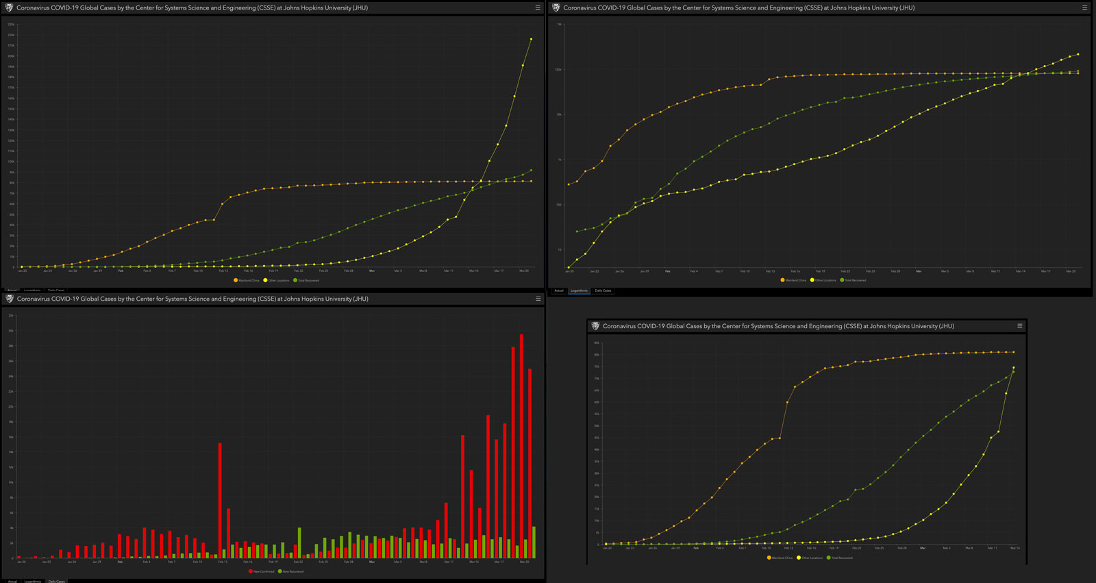
Looking at the four charts above – all show what appears to be an extremely rapid increase in the number of coronavirus cases worldwide. The three large charts are different methods to show the same data, and they illustrate how dangerous it is to take any emotional stance based on the “feeling” of information when presented visually.
The chart in the upper right for example is based on the same data as the chart on the upper left, and yet it appears far less alarming simply because it is plotted logarithmically, causing the “curve to appear flatter and less “alarming” unless you bring expert eyes to the charts.
Nevertheless, it does’t take a doctor or even a scientist to see events that are unfolding and make a judgment on what is likely to happen next. Unfortunately, as humans, we are often prone to clouded conclusions and even false interpretations of data, especially as a layman looking at charts and figures.
Clearly, this is the very good reason why we look to professionals, epidemiologists, doctors and event statisticians and computer modeling experts to help us make sense of something like a global pandemic outbreak.
Yet at times, perhaps this time in particular, it takes a reporter’s eyes looking at various expert sources and various aggregations of information and knowledge to try and craft an unbiased overview of the rapidly changing landscape even as it continuously develops.
That is what reporters are tasked to do and, with various success rates, to do on a daily basis. It helps to use a little common sense as well, particularly at times when fear and emotion are running high.
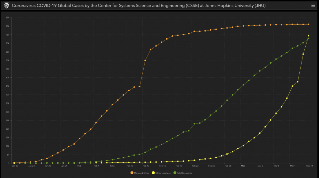
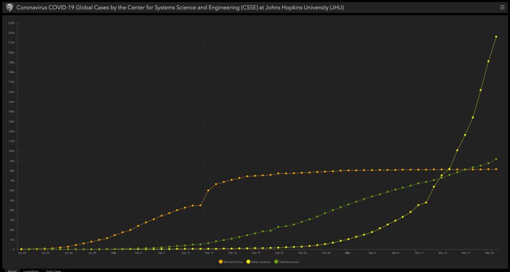
Many have likely seen the chart above from March 21st – which is available in a live interactive version here, posted by the Center for Systems Science and Engineering (CSSE) at Johns Hopkins University (JHU). The overall change over time can be seen when comparing the two charts, simply showing the increase in the number of cases on a daily basis. The data is separated into three categories:
- Mainland China
- The rest of the world (other countries)
- Total Recoverd
The reason for this grouping is that, early in the breakout during January and February, the vast majority of new cases were in Mainland China and the increase in new cases was growing very rapidly. More recently, as can be seen in the second chart, the rest of the world has not only overtaken China in the total number of cases but also in the increase, or acceleration, of the number reported per day.
When breaking this data down over the past two weeks, in a “news” context, there have been stories about how various countries and governments were dealing with the crisis, and attempts were made to draw conclusions and learn from those examples.
South Korea was cited as an example of a country that took a very proactive approach to testing for the virus, which can be carried by people that do not exhibit any overt symptoms, and methods such as a government funded drive-through testing program were implemented. Tests administered per day were estimated at 15,000 in a country with a population of 51 million.
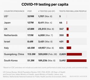
This is where pure numbers and science diverge from a common sense look at the extenuating circumstances. It is logical and often cited that the more testing and reporting done the faster the number of cases will grow. For example, at a time when the USA was testing approximately 5 patients per million in population, South Korea was testing 3,692. The chart below was created by, and is shown courtesy of, Business Insider.
Similar to the stock market, which is a vast world of endless charts and data, this is a perfect example of the adage: “correlation does not imply causation”. In other words, if you are measuring the number of new confirmed cases, as a way to show the spread of the disease, the relationship of that number, to the number of tests administered, is essential in any interpretation of the data.
Is the Glass Half Empty, Half Full or just a Cup of Confusion?
There is a planet sized elephant in the room when you begin to try to gauge the spread of the coronavirus in the USA. In essence, what this means is that the frantic counting of the “spread” in various countries to see where the number of cases is rising the most rapidly is, in effect, counting not the number of infected people but the number of tests being administered and the velocity of the reporting.
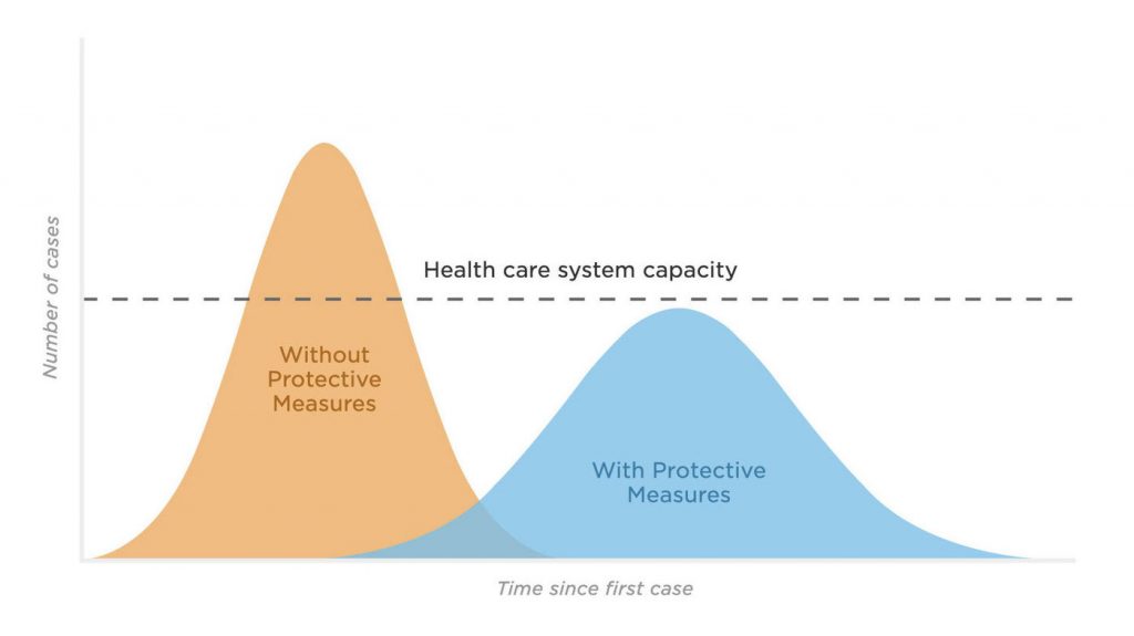
So, going back to the example of South Korea, by aggressively testing and quarantining those found to be carrying the virus they were able to “[flatten the curve]”, which is the ultimate goal of lock-downs and self-isolation and all other measures we can take in lieu of the availability of effective treatment options.
A relatively unimportant side-effect of the rapid testing was a temporary large increase in the number of confirmed cases. More important was the success based on the separation of more people carrying the virus from the general population, informed by the results of all those tests.
Mainland China, along with, to a lesser extent, Singapore, Hong Kong and Taiwan appear to also have had some success in slowing down the spread via quarantine.
Which leads to the confusion in the USA as to the severity of the spread and the steps being taken to try and flatten the curves. The USA is now taking action, in the hope to be among those countries who have had some measure of success, rather than joining Italy, Iran and others, mainly in Europe, that have been struggling with a surge in illness and deaths, due to the spread of the virus.
Testing in the USA is starting to increase, finally, after a chaotic and late response by the Trump administration. What this means, however, is that the testing itself will lead to an increase in the number of “confirmed” cases and the rate of that increase will also likely be higher, for at least several weeks.
In the Confusion, a Hidden Thread of Good News is Lurking
Essentially, this means that nobody can look at a chart of the number of cases and discern any comparisons about the real numbers of people infected, other than that the number is growing fast, unless the rate of testing is somehow factored in.
And, further, that the so-called lockdowns and other serious steps are more than warranted as , particularly in the USA, the “real” number of infected people is almost certainly far higher than the published number.
nobody can look at a chart of the number of cases and discern anything about the real numbers of people infected, other than that it is growing fast, unless the rate of testing is somehow factored in.
– E.C.
The examples in the areas where partial containment or at least a slowdown in the spread were the most successful, occurred in those locations where steps were taken, as quickly as possible, to quarantine those that could spread the disease to others.
Unfortunately, the “South Korean model”, focusing on rapid and aggressive testing, has not been an option in the USA. Instead we have basically skipped that step and proceeded to a “lockdown”, of, at this moment, over 70 million people in 5 states, with likely more to come.
Digging beneath the data we can see that the charts are best used, not to alarm unnecessarily, but to inform of the degree to which the steps toward prevention are warranted, and why we should all avoid panic and creatively isolate and maintain safe social distances.
We should all bear in mind, when looking at the charts and the statistics, that a rising chart does not necessarily mean that the situation is spinning out of control.
Incredibly, it likely means that the implementation of controlled steps, such as an increased number and frequency of people being tested, will result in a temporary “bump” in the “bad news” but that news will be, in reality, hidden good news. Namely, that we are finally beginning to proactively respond as a society and, as has been seen in South Korea, this can and should lead to a calming, flatter curve on our charts in the weeks to come.
Read more on coronavirus:
Corona Crisis comparison to London Cholera epidemic is haunting: The Ghost Map
Books to Luxuriate in While Practicing Preventative Isolation from covid-19
Healthy Whole Grains and Bread Culture for Building Resilience
As covid-19 Spreads the Shopping Spree of the Century Underway across USA
Oh Sweet Resilience, your Name is Golden: Coronavirus Musings Straight Outta L.V.
Coronavirus Sparks Shopping Sprees in U.S. and More Up-to-the-minute Developments
Enjoy Lynxotic at Apple News on your iPhone, iPad or Mac
Find books on Coronavirus, Climate Change, Sustainable Energy and many other topics at our sister site: Cherrybooks on Bookshop.org
Lynxotic may receive a small commission based on any purchases made by following links from this page.


%2Fcdn.vox-cdn.com%2Fuploads%2Fchorus_image%2Fimage%2F32949333%2FScreenshot_2014-05-12_18.32.08.0.png&imgrefurl=https%3A%2F%2Fwww.vox.com%2F2014%2F5%2F13%2F5710874%2Fthe-best-illustration-youll-see-that-correlation-doesnt-equal&tbnid=BSuw51SA8I4QwM&vet=12ahUKEwjx-6bGwazoAhUuh54KHVjvCGwQMygkegQIARBR..i&docid=20HaRYmz5iZvkM&w=1200&h=800&q=correlation%20does%20not%20equal%20casualty&client=safari&ved=2ahUKEwjx-6bGwazoAhUuh54KHVjvCGwQMygkegQIARBR)